SARAH BIERMAN

Designing a homepage for an estate planning wizard
“Sarah has a great designer’s eye and ability to hone in on the key design elements of a product. Her hands-on user research helped take our landing page—a critical part of our product—to the next level. She meets deadlines and always communicates progress. Sarah goes above and beyond to invest time and energy into our product and the business. I recommend her for her visual UX knowledge, fearless user testing, and ability to take action "
Alice Karvasar, Founder
I designed the Easy Trust homepage using market and user research to inform my design decisions and deliverables. I worked closely with the founder and senior engineer to ensure that my design was hitting business and engineering goals. As the only designer on the project I had a lot of room to explore.
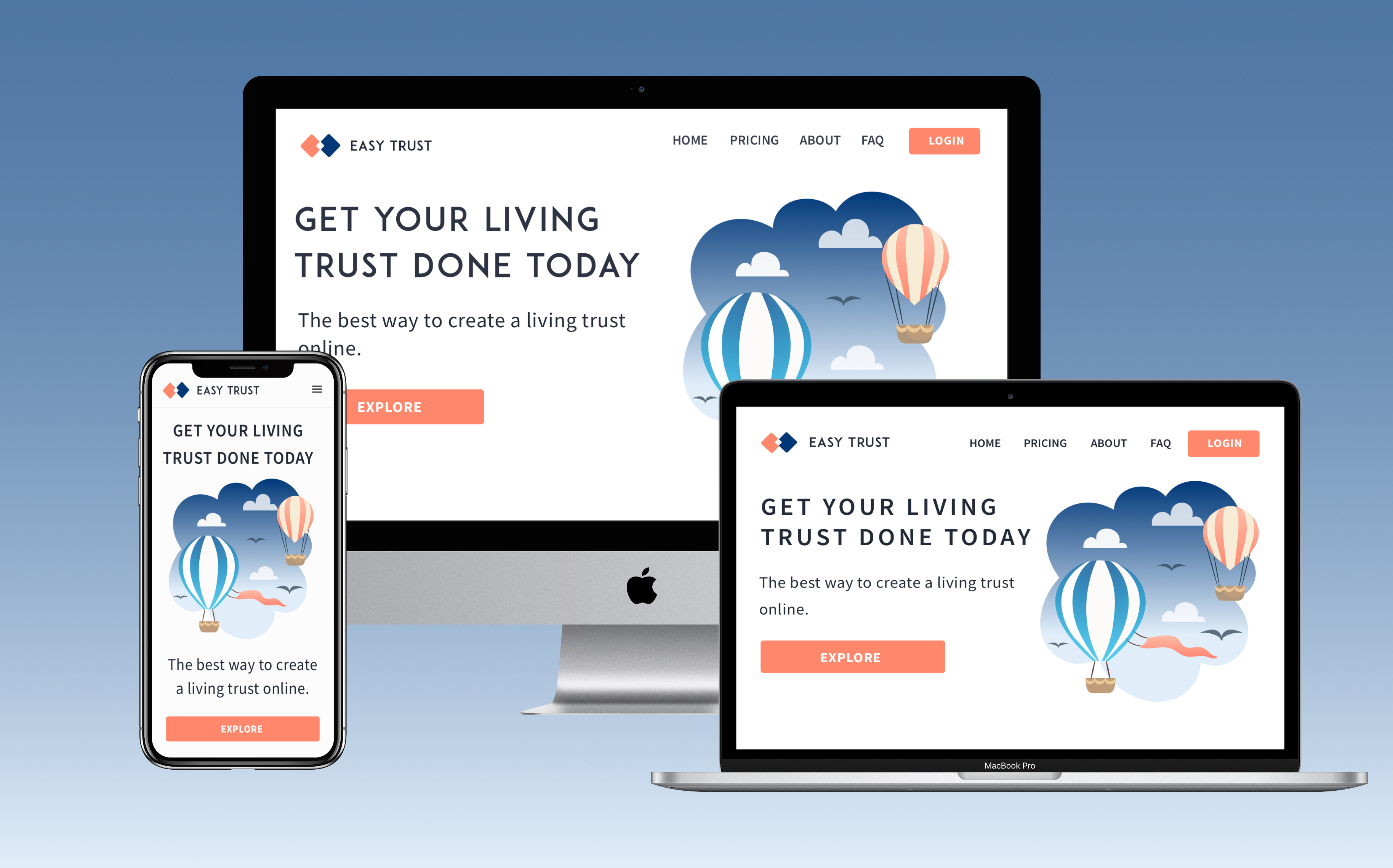
Easy Trust Maker is disrupting the death planning industry by making Revocable Living Trusts accessible to everyone. Living trusts are preferable to Last Wills and Testaments because they ensure beneficiaries can obtain their inheritance without the hassles from probate. Probate is expensive and time consuming.
Living trusts are better in the long team because the high upfront cost deters even the most prudent consumer from making the better choice. Lawyer can cost up to $2k and the document can take weeks to materialize.
Easy Trust offers a way for consumers to create a living trust without the expense, time, and headache. Consumers fill out a multi-part form and are guided by our support team to complete the next step in the process, making the experience seamless.
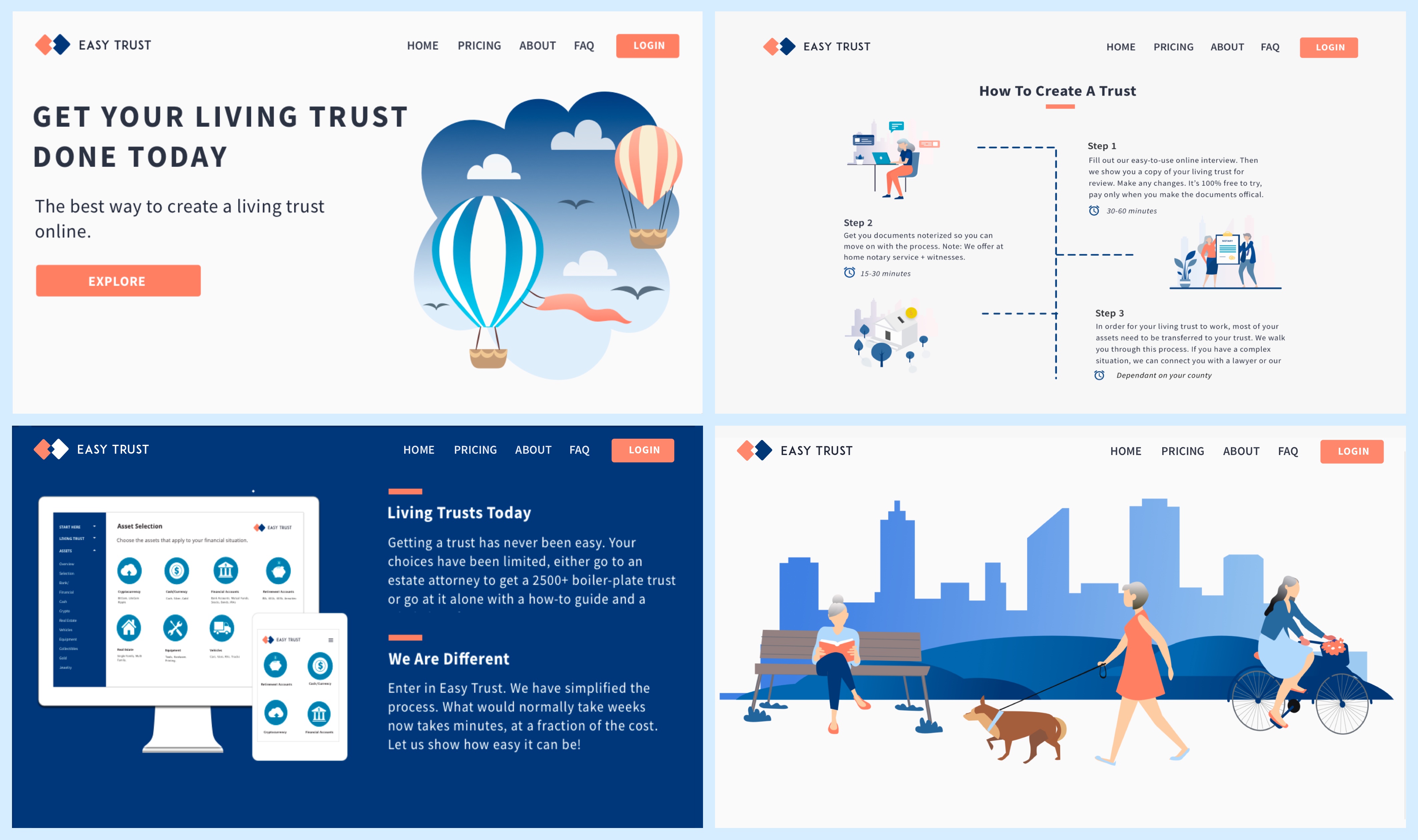
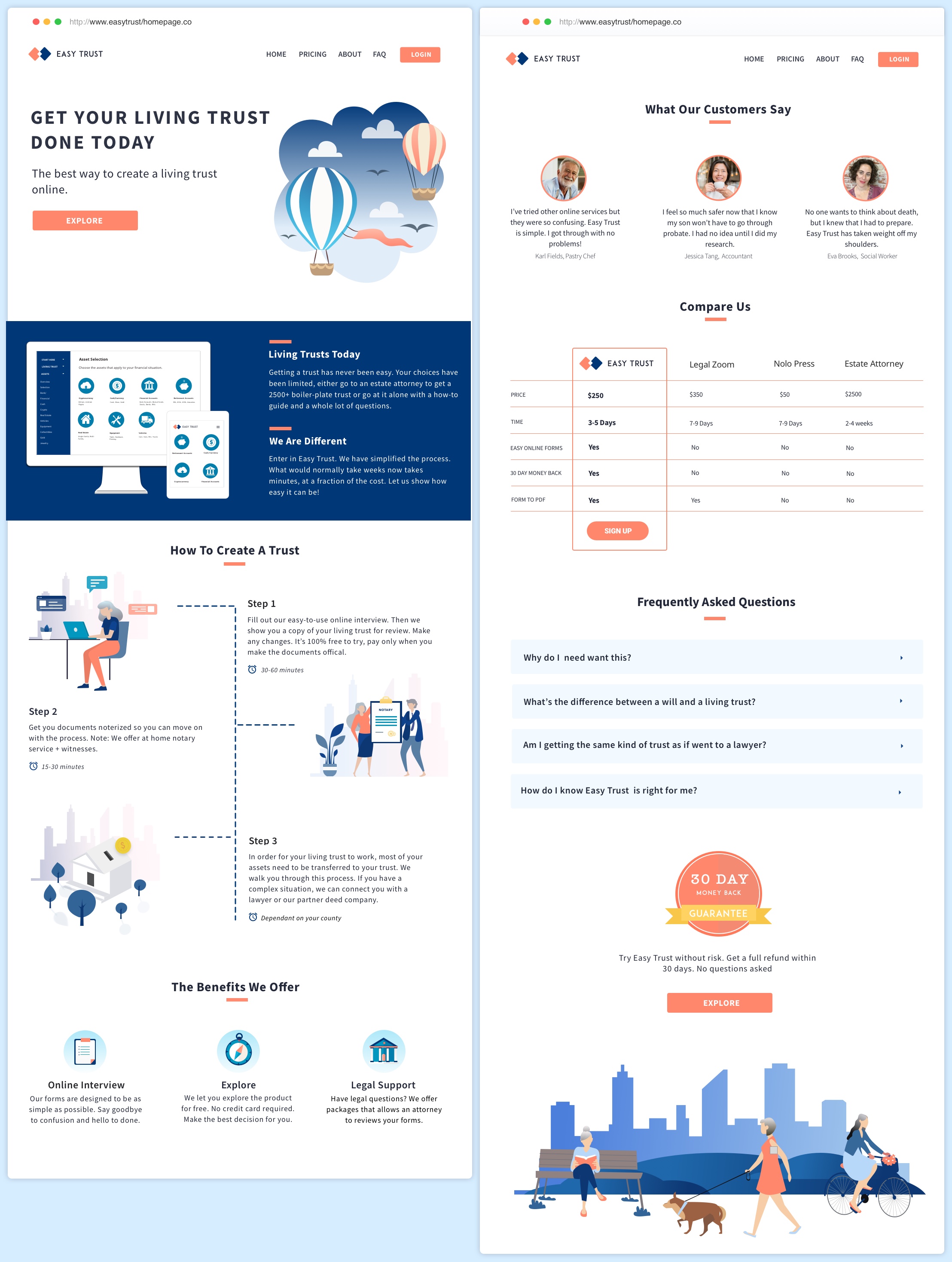
Create an inviting experience where consumers feel comfortable about death planning and are motivated to explore the product. I created the following responsive web pages.
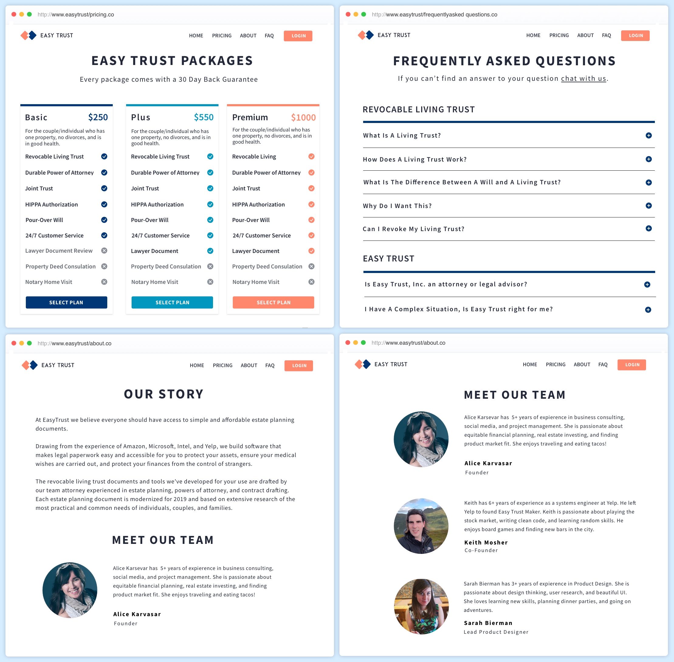
1. Homepage
2. Pricing
3. About
4. FAQ
My core business goal was to convert consumers. I wanted them to enter the form portion of the site, via the call to action button Selling a product that puts death front and center posed a unique challenge.
I knew that in order to appeal to baby boomers, I had to pay special attention to the messaging. I also had to make sure that the homepage avoided morbid, clinical, or pushy language.
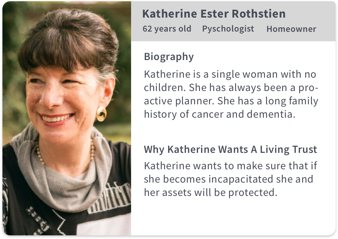
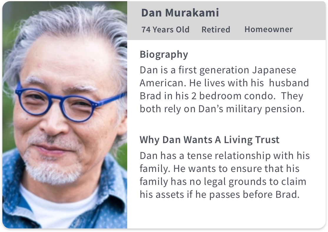
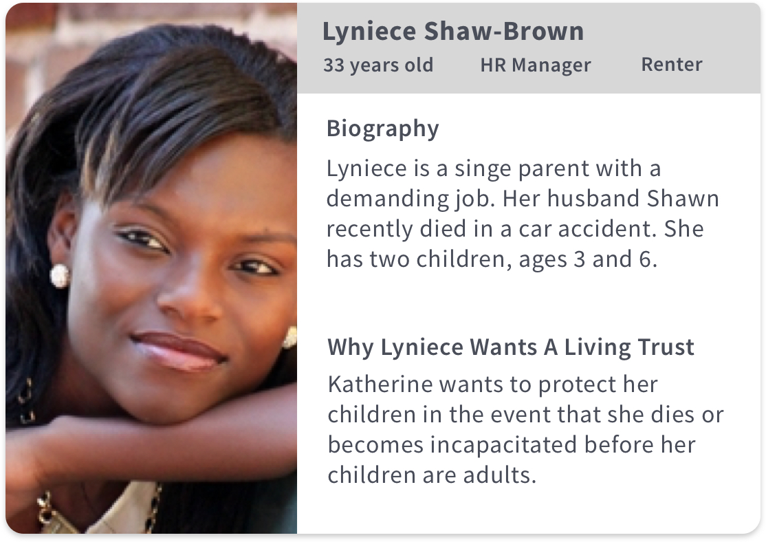
I wanted to be intentional about who I sourced for usability testing. I created some proto persona's to help me define my audience. Proto Personas are not research backed and should not be used for design decision but they can be helpful in the early stages of a UX project.
I skipped customer interviews because I wanted to get feedback on my ideas as soon as possible. I’m a proponent of the pasta method, throw your ideas at users and see what sticks.
I made the assumption that our user segment had limited knowledge of the difference between a revocable living trust and a last will and testament. So I emphasized the benefits of a revocable living trust in the homepage.
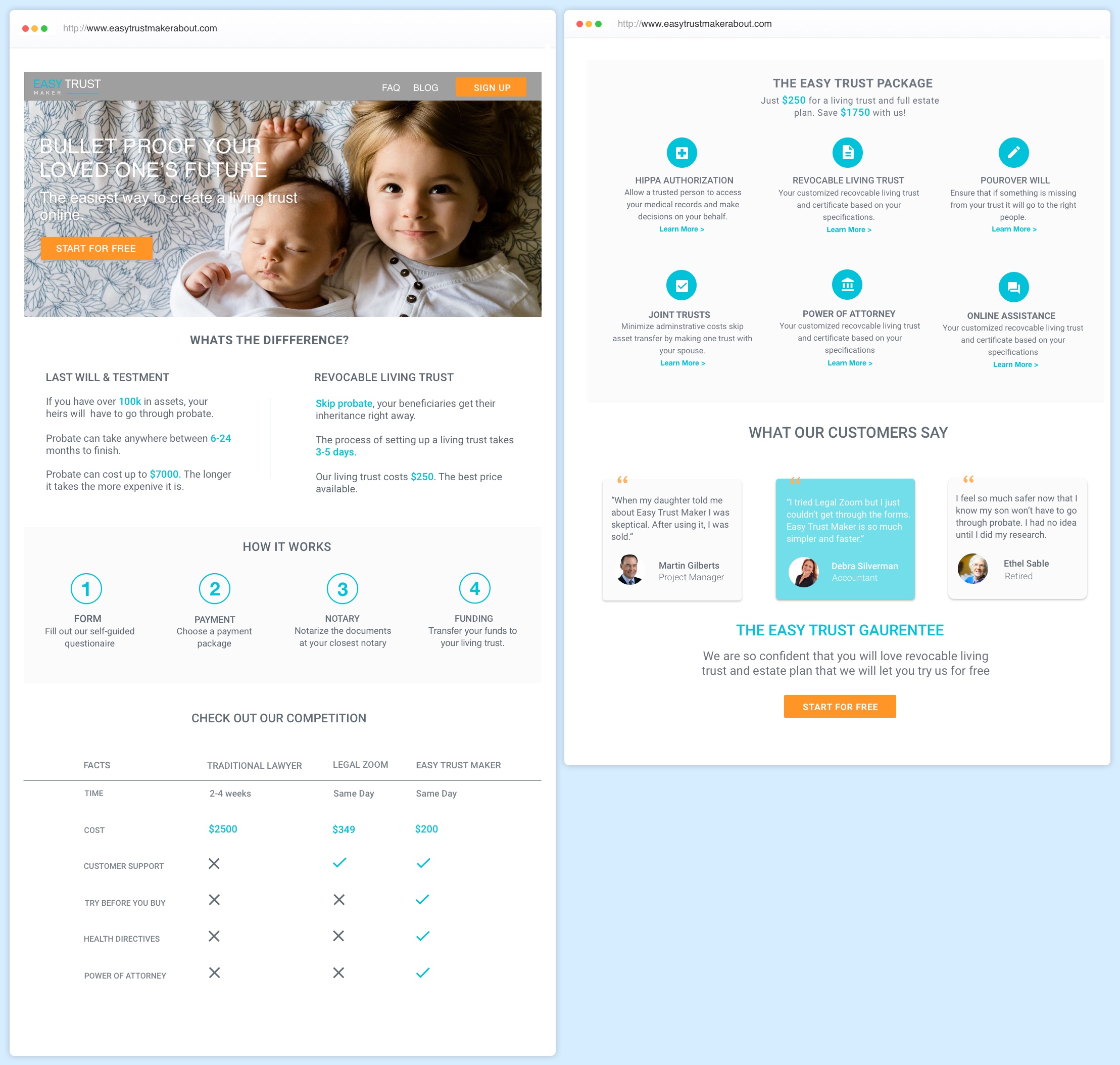
I began my research phase by testing a quick and dirty hi-fi homepage, rather than generating wireframes. I made that decision because
I wanted to see how users responded to my choice of colors and images. I also wasn’t sure my core demographic (baby boomers) would understand what a wireframe is and I didn’t want to add friction.
Learning Goals
What is the consumer’s knowledge base regarding probate, living trusts and wills?
Do they want to click on the orange button?
Do they understand the content created?
Do they trust the site?
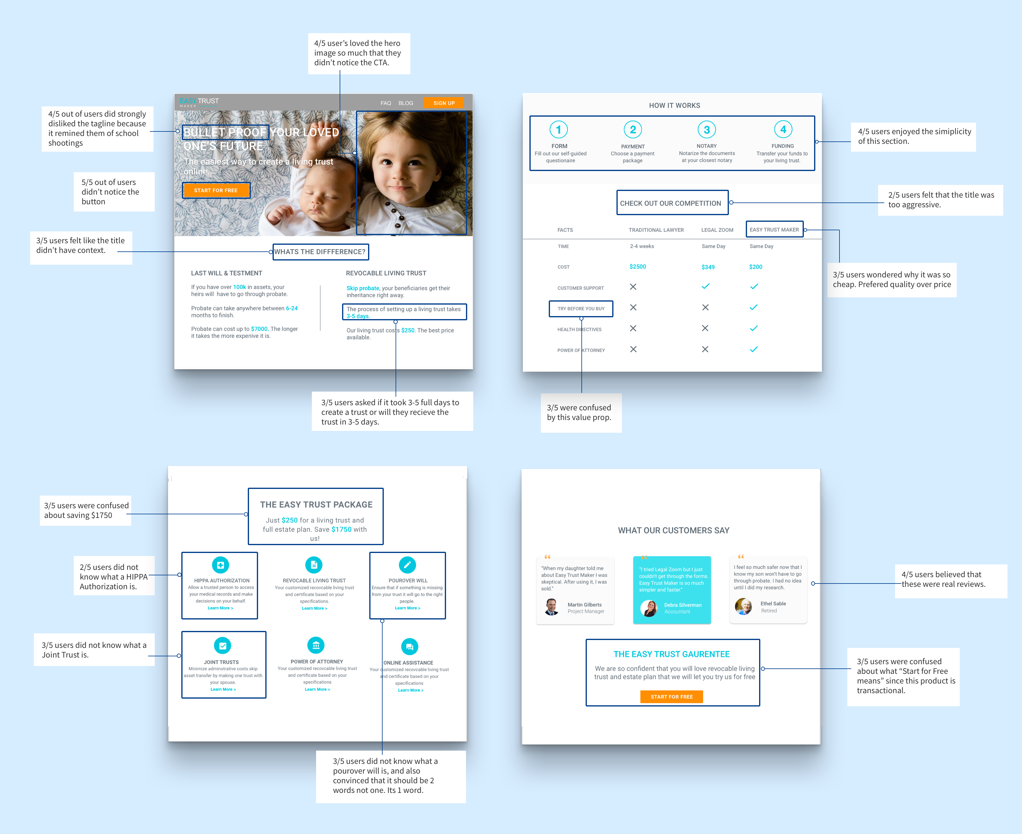
The research was incredibly helpful in finding out what worked and what didn’t. The main thing that I learned was that my audience was more concerned about the quality of the product as opposed to the benefits of a living trust. Going forward it was obvious I needed to emphasize Easy Trust, the product.
“I would more than be happy to spend more if I knew what I was getting is a good product. "
Debbie, User Participant
What is the consumer’s knowledge base regarding probate, living trusts and wills?
I found that my assumption that baby boomers didn’t know much about living trusts was wrong. Baby boomers were quite savvy when it came to probate, living trusts and wills. I realized that if a consumer is searching for living trusts, then they already know the benefits of a living trust.
Do they want to click on the orange button?
Users didn’t notice the orange button and therefore didn’t have an opinion. The hero image outshined the CTA.
Do they understand the content created?
All of the participants were confused by the comparison between living trusts and wills section. Although they saw the clear benefit of living trusts over wills, they felt like it had no context.
Do they trust the site?
In retrospect, I think this question was a poor choice for a metric. All of the research participants said yes, however that might have been influenced by the fact that they knew me and trusted me as opposed to actually trusting the site itself.
After the response that I got from the user research I wanted to go into a different direction in terms of color and branding. I did a lot of exploration and dribble stalking. The head of product and I discussed a lot of options. Nothing felt right.
After work, I went to the ferry building and sat on a bench, I alternated between ruminating about my talent as a designer, and obsessively reading medium articles about color theory. And then I looked up, it was getting dark and the sun was setting and there it was, my color palette. Cobalt water, purple columbus clouds, and streaks of salmon on the sky. Sometimes the most obvious things are right in front of you.

The founder and I sat down and discussed what we had learned from the research and my new ideas about color palette. We decided to emphasize security, ease of use, and the price as opposed to the previous emphasis. We also decided to use illustrations rather than photos because we wanted to seem friendly and inviting.
I tested the final homepage and pricing page with an additional users. Users were far more enthusiastic about the new homepage than they were about the previous one. They really enjoyed the flow and found it simple and easy to understand, and 2 users asked if they could sign up on the spot.
There was some feedback regarding the placement of the “how to section” and the start for free button. Users wanted the how to section to be closer to the hero image, and they felt like the “start for free button” was too pushy. I changed the button to explore, and pushed the how to section to the third section.
The homepage is part of a larger rebrand effort at Easy Trust Maker. We have launched V1 as our MVP and are at work designing the second iteration. V2 will be called Easy Trust and will follow the visual language I have outlined. V2 Launch will be in late fall.